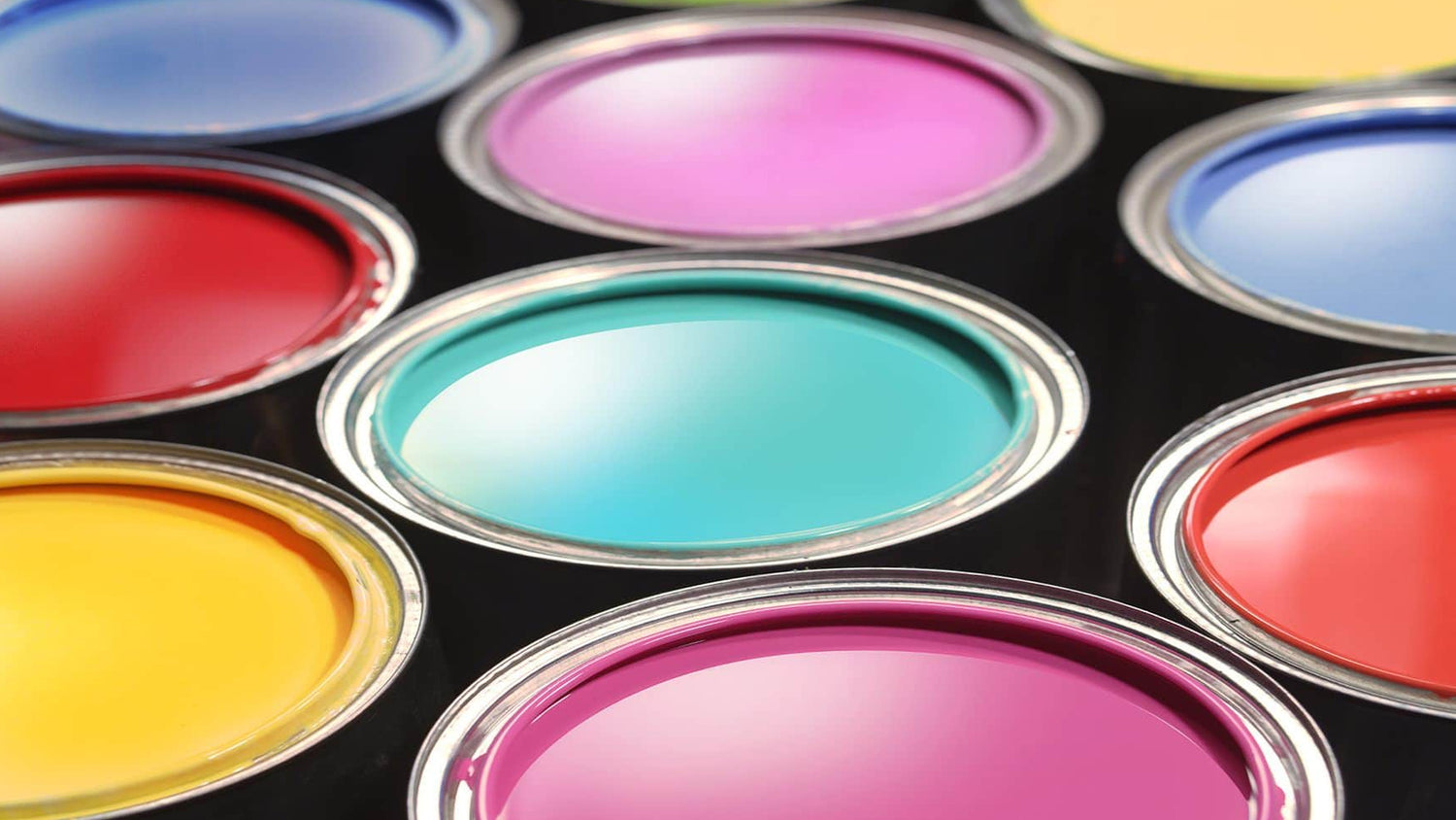
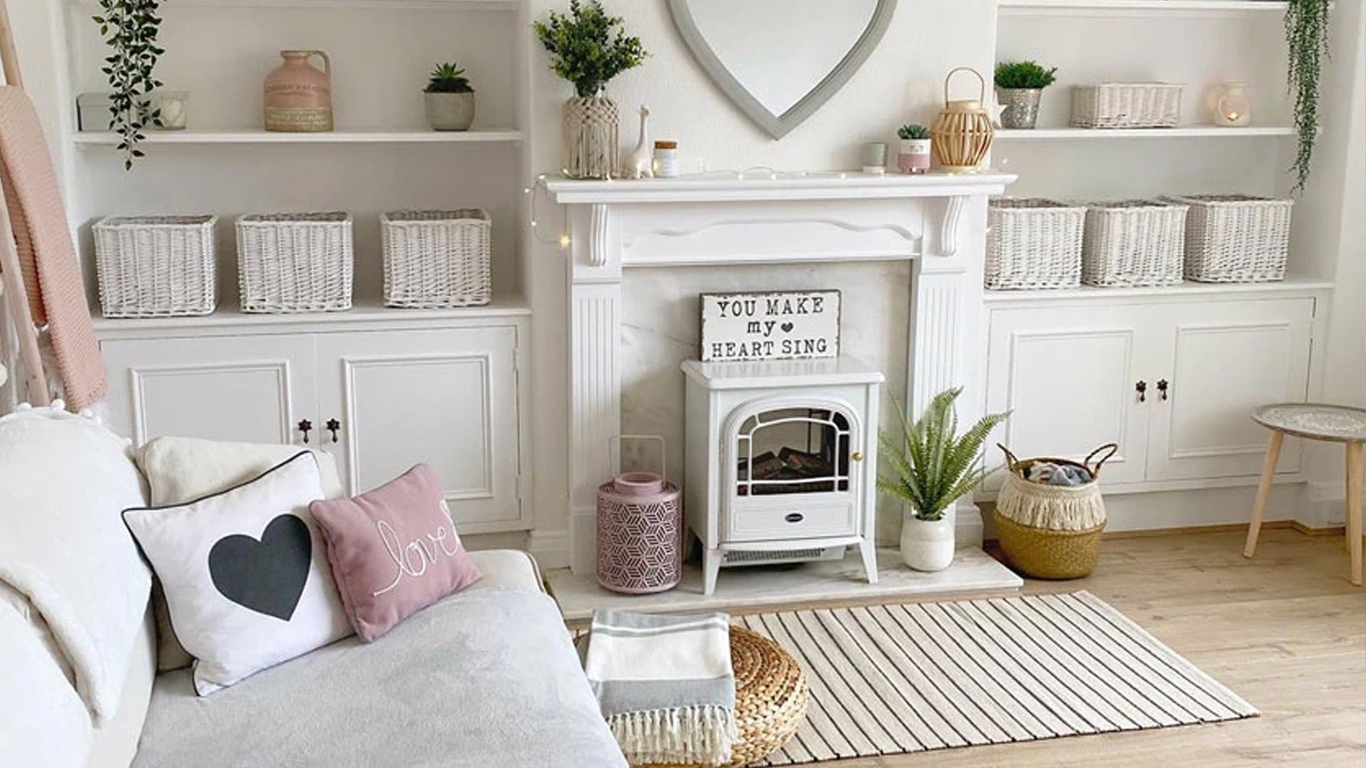
Kind of. While there aren’t really any rules (rules are made to be broken, after all), following colour theory will help you a lot when it comes to deciding which paints match and clash.
We will cover the basics here using the colour wheel to show which ones work in harmony, and which ones don’t.

Analogous
This is when three colours are next to each other on the colour wheel. They tend to be similar shades, but work harmoniously together. So this might be indigo, violet and navy blue.
Triad
A triad colour scheme uses colours that are evenly spaced around the colour wheel, which forms a triangle. To use a triadic harmony successfully, the colours should be carefully balanced, and you should let one dominate.
Complementary
According to colour theory, colours opposite each other on the wheel are called ‘complementary’, but these are pairings we would normally associate with clashing.
7 combinations to avoid
Sometimes colours that aren’t supposed to go together do work very well.
This is mainly because they contrast each other and can be used to make something stand out. Or, because you have considered different shades, tones, saturation, and ratios/amounts when you’re putting these colours together. This can all affect how well they match up.
But generally speaking, there are certain colours that just don’t go well together. Here’s a list of seven paint colour combinations that (usually) clash.
1. Hot pink and red
Putting two similar colours together, both bright and bold, often results in disaster. Dark red is a warm colour, and while magenta is technically a warm colour, it can have bluish undertones, which can make them clash really badly.
2. Dark brown and black
Didn’t your mother ever tell you? Never put a black bag with brown shoes! This is a big no-no in everything from fashion to interior design. Black and dark brown are two very strong colours and should each serve as a base for different colour schemes.
3. Khaki and orange
These colours don’t go well together because again it’s pairing a warm colour with a cool colour. Earthy colours like khaki or dark green with bright colours like orange can look garish and be easily overpowering.
4. Blue on blue
Too much of the same colour can be overwhelming sometimes. And trying to be too ‘matchy matchy’ with colours can actually work against you. Also, having just one colour in your scheme can look bad if you pair the wrong shades together. Certain shades of blue can look weird or ‘off’ with turquoise or teal, for example.
5. Pillar box red and green
They say “red and green should never be seen.” Similar to orange and green, these two festive colours can be an eyesore when combined. Whether it’s lime green, a pale green, olive or emerald green, it just doesn’t sit right with red.
6. Royal purple and yellow
A strong purple paired with sunny yellow is jarring. Similar to how a black and yellow wall looking like a bumblebee would not be a great addition to your kitchen or living room, this can look off because of the strong contrast between the two.
7. Sky blue and orange
These colours just don’t sit nicely together. They are directly opposite each other on the colour wheel. One’s warm, and one’s cool. And it’s very hard to imagine a situation where your walls painted these two colours would work!
A shout-out to so-called clashing combos
All of that said, there are some examples of colour combinations that really shouldn’t look good together – but they just do. If you really love two specific colours, there are lots of ways to make them work without it being an eyesore! Here are some examples:
- Adding other colours into the mix – Sometimes if you have two colours that don’t go together, you can tie them together nicely with more colours to get an analogous or triadic colour scheme. This stops it looking like two blocks of contrasting colour. The other colours will soften the palette. Adding a dusky blush to deeper sunset shades can look great, for example.
- Muting colours or changing the shade – Sometimes muting one of the clashing colours or changing the shades will make them complement each other better. Royal purple and green might not go together, for example, but change this to a softer lavender or mauve and sage green, and you’re onto a winner.
- ‘Clashes’ in nature – Often, colours that would clash on your wall paint appear together in natural settings and look wonderful. Sunsets and autumn leaves put bold red and orange together. Or lavender flowers with green stems for example. Try a floral print for furnishings or accessories if you want the colours but not in block colour paint!
- Deliberately clashing – Sometimes, clashing patterns are used deliberately for a dramatic or daring effect. This happens a lot in fashion, and also interior design. William Morris prints used to be ‘in Vogue’ as matching wallpaper and furniture upholstery in the 90s! In reality, this is far too busy. But it was fashionable, and it worked.
- Just a splash of the clash – Sometimes just a splash of the clashing colour can look great. Try cracked paint for an aged effect, and to reveal two different, contrasting colours.
Perfect your colour scheme with Frenchic paint
Whatever look you want to achieve when you’re decorating, Frenchic has the paint for you. With a wide range of high quality, eco-friendly chalk and mineral paint, you can easily find the right shades to go with your colour scheme.
Whether you’re painting your walls or upcycling furniture – order one of our true-representation colour charts to start matching your colours today!
