


Covering a range of plant-related shades, botanical paint colours are a great a way to add a little or a lot of nature to your home. They work well as the main event, such as painted kitchen cupboards. But they look equally at home on a single piece of furniture, adding a pop of character and interest.
Keen to find out more? Read on as we explore the botanical style, some beautiful paint colours and how to incorporate them into your space.
Behind the botanical style
The botanical style is more than just a design trend. It draws on our innate human instinct to connect with nature and other living beings. This is the essence of biophilia – the principles of which are said to contribute to improvements in physical and mental health, encourage positivity and promote a sense of wellbeing.
This is backed by Harvard research, which measured the impact of biophilic indoor environments on participants’ recovery following stressor tasks. The results showed a positive impact on heart rate, skin conductance, blood pressure and anxiety levels of participants (measured using a State-Trait Anxiety Inventory test).
There are many ways to apply biophilic principles into your home, including:
- Maximising light
- Incorporating natural materials and textures
- Having an abundance of plants
However, another super-simple way of tapping into this is to decorate and accessorise your home using natural colours, especially botanical paint colours.
What are botanical paint colours?
Greens, greens and more greens! As the archetypical botanical shade, green is certainly the go-to when it comes to botanical paint colours. With that in mind, it’s handy that green is a hot colour trend.
Studies show that green is calming and can reduce heart rates. Qatar researchers found that walking in a green environment reduced heart rate values compared to red or white settings, for example, while a team at Coventry University uncovered a positive impact on children’s blood pressure 15 minutes after exercise when cycling in a green forest setting.
Best of all, greens are more varied than you might think. The umbrella term ‘green’ covers a whole smorgasbord of botanical paint colours, including:
- Dramatic, deep forest tones
- Light and airy grey-greens
- Fresh spring greens
- Aqua tones of bluey-greens or even greeny-blues
- Unique shades like avocado, lime and olive
How to use greens
If you can’t wait incorporate green into your space, the next question is what you’ll pair it with. Thankfully, there is a spectrum of colours that look absolutely beautiful next to various shades of green.
Whites
The first is simple white. Racing green Victory Lane looks great next to white tiling in the bathroom below.
The same combination has been used on a customer’s kitchen, with Victory Lane green cabinets paired with marble-effect white countertops.
Off-whites and pastels
Another great option is using off-whites and pastels for a delicate chintz theme. Wise Old Sage looks great on the bathroom cabinet, panelling and mirror below. The sage green tone is perfectly complemented by a floral pattern and off-white Parchment on the walls.
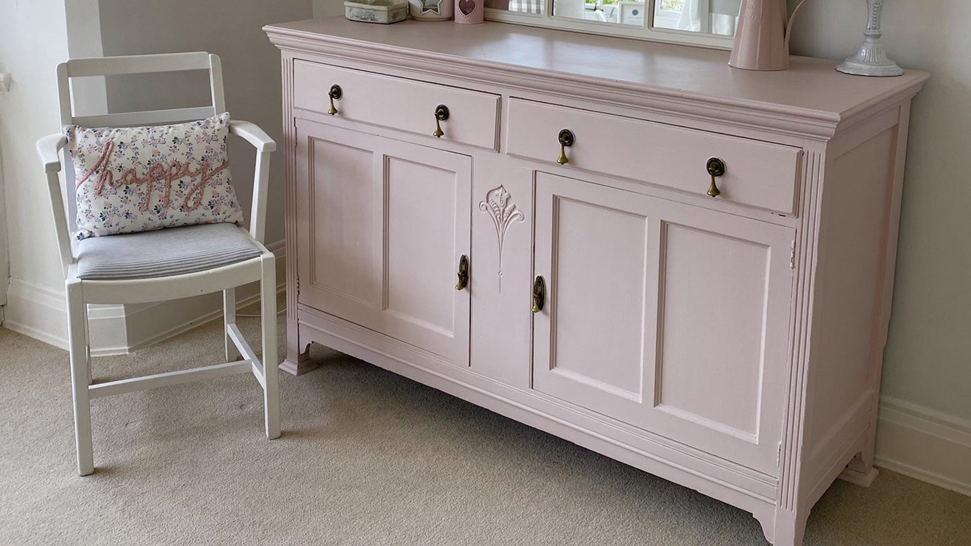
Or how about the adorable combination of Apple of My Eye and Dusky Blush below? The two vintage colours look stunning as accents in an airy white space, along with floral hints on the lamp and cushion.
Metallic accents
Metallic accents are yet another great accompaniment to green botanicals. Metal features are used sparingly on these wardrobes transformed with Constance Moss, paired with a metallic mirror to complete the look.
The same look can be achieved in the kitchen, with a natural green like Constance Moss and metallic handles on cabinets – brought together by metallic features and utensils throughout the room.
Or even blues
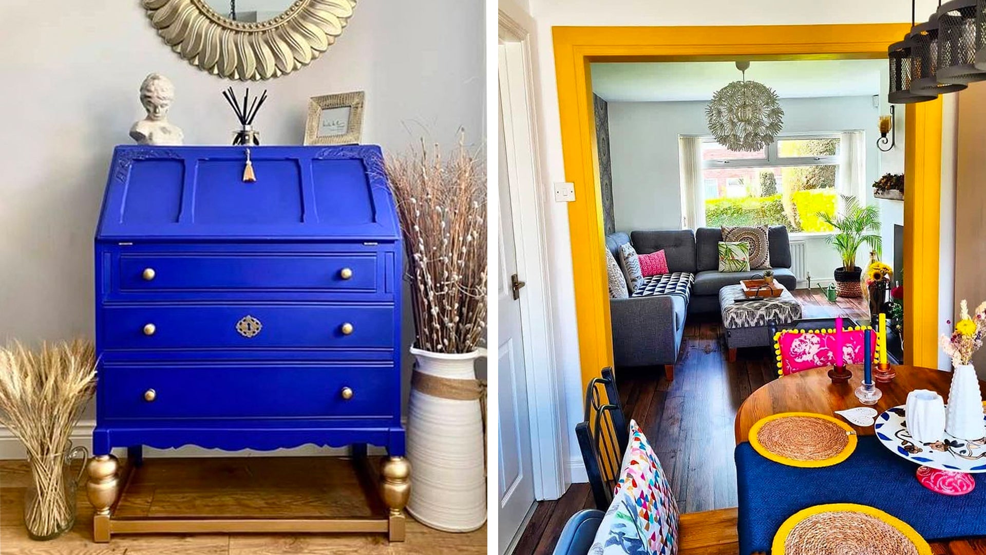
If you want to get even more creative, green shades can look incredible next to their cold counterpart, blue. Apple of My Eye and jewel-like Steel Teal are combined on this preloved dressing table. Easy Crackle has been used between the layers for a shabby chic, aged appearance.
Ready to be impressed? Check out the stunningly transformed chest of drawers below, using a combination of racing green Victory Lane, heritage green Pea Soup, turquoise Anguilla, bold, dark blue Hornblower and off-white Parchment (Trim). The result is a mesmerising botanical pattern.
Alternative botanical paint colours and how to use them
While green is the quintessential botanical paint colour, there are plenty of other hues to play around with. Yellow is a great way to brighten up your space, with mustard yellow and ochre shades seeing a particular rise in popularity. Self-sealing Hot as Mustard provides an easy way to add this zesty botanical to your own furniture, like the drawers below.
For a subtler botanical vibe, try spring colours like pastel pinks and blues echoing the return of clear blue skies and blossoming flowers.
Go bold as above, with a duck-egg Duckling front door and vintage pink Dusky Blush shoe bench. Or keep it subtle with delicate, soft pink Ballerina and palest blue Crystal Blue like the table and nest of chairs below.
Time to get botanical
Whatever your favourite botanical paint colours, Frenchic can help you incorporate them into your home with ease. We stock a selection of high-quality chalk paints in botanical shades, with minimal VOCs and self-priming qualities.
Choose from The Lazy Range for self-sealing simplicity, Al Fresco inside/outside range for added weather-resistance, or Original Artisan Range for a traditional style chalk paint. Our ultra-matte Chalk Wall Paint range also includes a choice of botanical colours, which are matched in our Trim Paint range for a subtle satin sheen – ideal for skirtings, doors, radiators, or any interior surface of your choice!
