


Contrary to popular belief, neutral palettes are multifaceted and exceptionally varied. From earthy browns to dusky pinks, there's an option to suit all tastes and styles of decor.
While every neutral is different, they have a few common threads. Most are inspired by nature, mimicking sand, trees and soil, and all are versatile enough to complement a dynamic collection of colours. Thanks to their subtle qualities, they promote relaxation and homeliness - transforming unwelcoming interiors into cosy havens.
Keep reading as we introduce the key players in a neutral palette. To help you choose a suitable scheme, we’ll explain the importance of natural light, undertones and texture. Then we’ll reveal our favourite on-trend combinations.
What makes a neutral palette?
Neutral means without colour. The four most common options include black, white, brown and grey. Near-neutrals are lighter or darker than their original hue with subtle undertones. For something to be neutral, it has to have low saturation and little pigmentation.
Examples of pure neutrals:
- Black
- White
- Brown
- Grey
Examples of near-neutrals:
- Tan
- Ivory
- Beige
- Taupe
- Off-white
- Sage green
- Dusky rose
- Khaki
Three things to consider when using neutrals
Neutrals are brilliantly easy to work with because they harmoniously blend with surrounding colours and furnishings. Nevertheless, you should carefully consider natural light, undertones and texture before finalising a scheme.
Natural light
The amount of natural light a space receives can help you decide what undertones to choose. Start by assessing whether your room is north, east, west or south facing.
North-facing and windowless rooms can feel dreary, even during the summer months. Consequently, choose neutrals with warmer undertones.
South-facing rooms benefit from plenty of flattering light throughout the day. Neutrals with cool undertones counterbalance heat and make stifling spaces feel larger and airer.
East-facing rooms feel cooler as the day progresses, whereas west-facing rooms warm-up from late afternoon to evening. Select undertones that capitalise on your favourite time of day.
Warm vs cool undertones
Warm neutrals have yellow, brown or orange undertones, whereas cool neutrals draw from blue, purple and green. As a rule, warm neutrals surround you to make spaces feel cosier. Cold neutrals reflect natural and artificial light for an expansive feel – perfect for smaller areas like bathrooms, kitchenettes and hallways.
Texture
No matter the undertone, all-neutral rooms (especially all-white rooms) risk looking flat and empty. As a result, create texture with an eclectic mix of furnishings. Woven rugs, leather sofas, wicker storage units and velvet curtains lend depth without the need for bold colour.
Five on-trend neutral colour schemes
Stuck for ideas? Here are five of our favourite on-trend neutral palettes. Whether you prefer calming cream combinations or pretty pink pairings, every recommendation promises to breathe new life into your home.
Earthy greens
Bring the outside in with green neutrals like Wise Old Sage and Wedgewood Green. Lighter than their emerald counterparts, they immediately brighten interiors to give the illusion of space. What's more, green reminds us of the beauty and abundance of the natural world. Much like wild woodlands and rolling fells, it's inherently uplifting and meditative.
For a shabby-chic aesthetic, use green neutrals in kitchens. Paint kitchen cabinets in sage and Dazzle Me white for an ultra-clean finish, and complete the look with pastel pink vases, indoor foliage and rustic tiling.
Warming browns
Brown neutrals are excellent choices for focal spaces like living rooms, dining rooms and bedrooms. Alongside cream, they create cappuccino-coloured cocoons that feel unusually antique and curated. Much like green neutrals, they draw from nature to encourage feelings of unabashed relaxation.
Those who prefer darker neutrals will love Funky Dora because it's rich without feeling overwhelming. Use it to upcycle old furniture and refresh woodwork for a standout effect. To create contrast and visual interest, add a lighter shade like Salt of the Earth to a panelled wall or statement piece.
Calming creams
Nothing soothes quite like cream. It's easy on the eye and subtle. Far from being boring, it's pleasantly unstimulating – ideal for busy homeowners looking to unwind and recharge.
Best of all, creams are adaptable. Parchment walls provide a clean backdrop for a wide variety of furnishings, meaning you have ultimate freedom regarding texture and colour.
One of the most popular schemes blends cream with grey. A decadent shade similar to Lady Grey adds dynamism and prevents interiors from looking bland. Tans and sands work equally as well, separating features for much-needed depth.
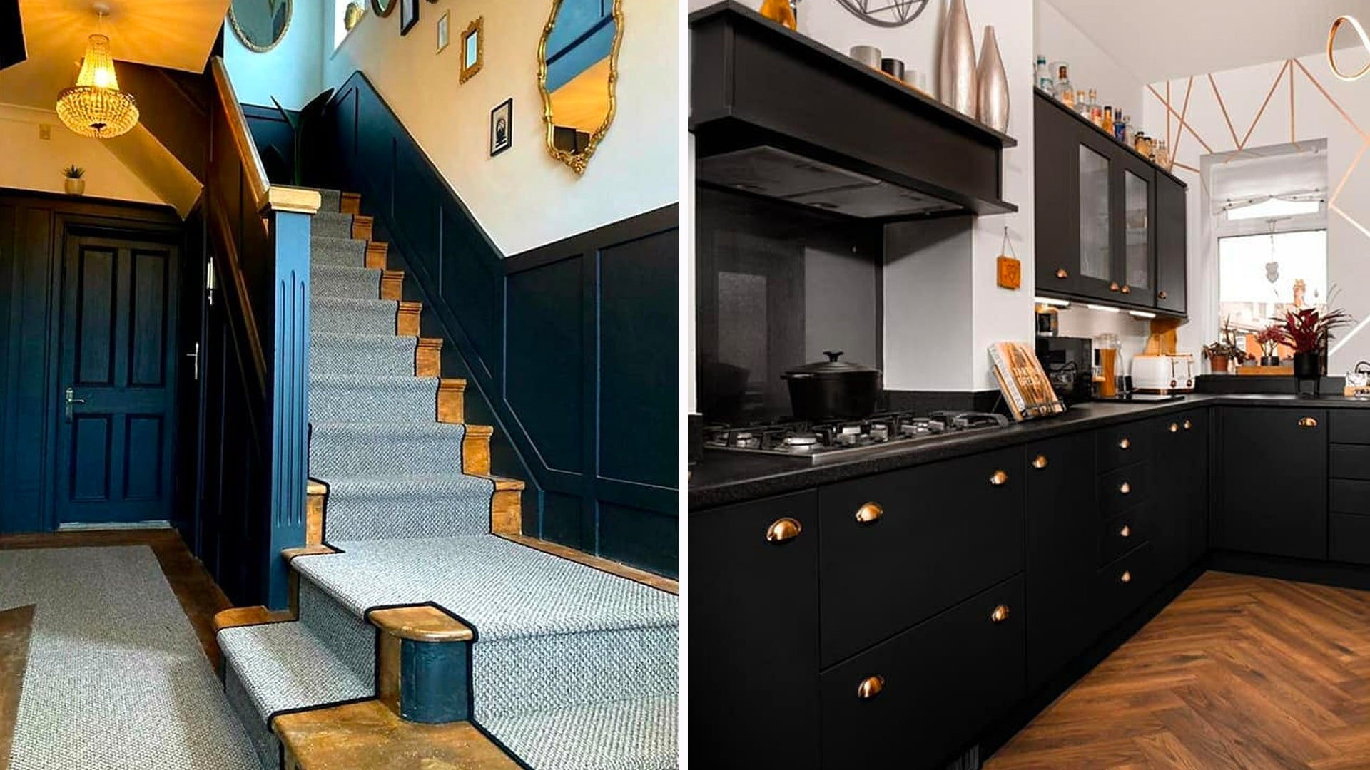
Classic black and white
Contemporary charm manifests in a classic black and white combination. The high contrast modernises and lends drama to the most unassuming of spaces.
Painting door frames and cabinets in Blackjack is a fuss-free and inexpensive way to revamp your interiors without undergoing a costly overhaul. White walls offset midnight hues to soften the overall finish, while Grecian chrome accents add intrigue.
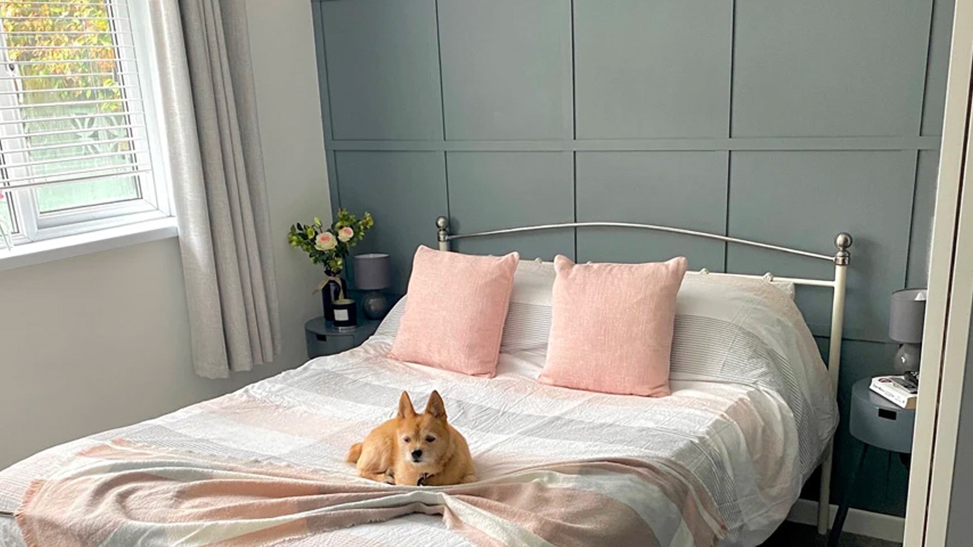
Pretty in pink
Without a doubt, everything looks prettier in pink neutrals. Unlike fuchsia, hot pink and plum, they're gentle and wispy like ethereal clouds overhead.
Muted shades, including Nougat and Dusky Blush, feel a touch more grown-up than pastels. Simultaneously, they retain pink's trademark playfulness and joie de vivre.
To break-up all-pink rooms, use Ivory Tower or Virgin white. If you're worried about interiors looking overly feminine, inject splashes of brown and green for neutrality.
Find a neutral palette with Frenchic
Whether you're decorating your walls, doors, interior doors, kitchen cupboards or furniture, our extensive collection of award-winning paint won't disappoint. We have a gorgeous neutral scheme to suit every theme, personality and setting, from dreamy creams to earthy greens.
If you're ready to revamp your decor, browse our Original Artisan Range, Lazy Range, Al Fresco Inside / Outside Range and Chalk Wall Paint and matching Trim Paint today. We also have a collection versatile waxes and quality brushes to ensure the perfect finish.
If you're still feeling uninspired, explore our innovative upcycling makeovers or visit our Instagram page. We share our favourite home makeovers, so you'll never run out of ideas.
