


Don’t you just love updating your interior décor with the changing seasons? Not only does it keep your space feeling fresh and current, it also helps create a harmonious and comfortable environment.
As the days get shorter and temperatures fall, warmer, richer colours can make your home feel more inviting and comfortingly cosy.
In this article, we’ll look at some beautiful autumn paint colours that can help you adapt to and embrace your indoor life.
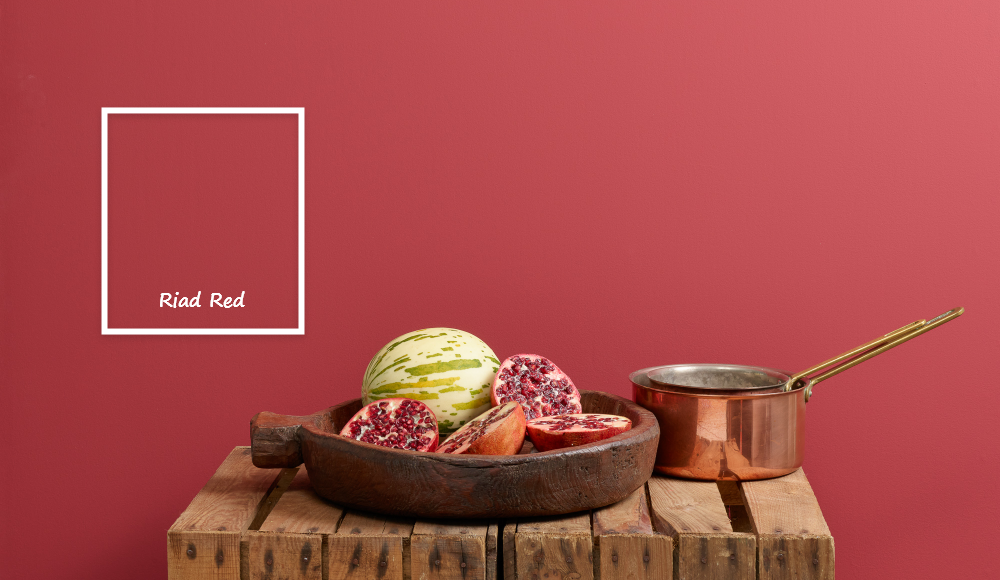
1. Burgundy bliss
Reds have enjoyed a resurgence this year, popping up and commanding attention in all kinds of interiors. As we move into the darker months, it’s no surprise to see these bold shades trending – none more so than burgundy.
A sophisticated twist on classic red, burgundy is infused with brown undertones, lending it a timeless, almost regal appeal. Riad Red and the rather more ruby-toned Rubina (below) are great examples.

Unlike brighter reds that have an immediate vibrancy, burgundy offers a cosy, grounded warmth. It’s a shade that comforts and envelops, making it a perfect choice for creating an inviting atmosphere during chilly autumn and winter evenings.
These deep red hues are more than just a statement – they’re designed to set a mood. When paired with low lighting or candlelit spaces, burgundy's depth transforms into a cocooning, intimate backdrop. Whether used on a feature wall or across an entire room, it creates a sense of rich sophistication, perfect for spaces where you want to relax and unwind.
2. Golden glow
Golden tones capture the essence of autumn sunlight indoors, adding warmth, energy and a quiet sophistication to your home décor. Shades like Hot As Mustard, Honeycombe and Oopsy Daisy bring a subtle, uplifting warmth to any space, evoking the glow of fallen leaves and harvest fields.
Golden yellows are surprisingly versatile. Used on a feature wall, they can make a room feel cosy and inviting without overwhelming your senses. Pair them with rich browns, deep greens or soft creams to create a harmonious, autumn-inspired palette.
These shades also work beautifully in areas where you want to foster a sense of cheer and comfort. Kitchens, dining spaces or even hallways benefit from the understated vibrancy of golden yellow, offering a welcoming backdrop that feels both timeless and contemporary.
3. Earthy orange
Orange is synonymous with the vibrant palette of autumn paint colours, bringing an undeniable sense of positivity and energy. While it’s a bold choice, these shades are more versatile than you might initially think.
The trick lies in selecting the right tone. Muted, earthy variations such as terracotta, burnt orange or clay shades are ideal for integrating into an existing scheme. Try Clay Pot, McFee and Earthy (below). These colours bring a natural warmth and are less likely to overwhelm than acid or vivid orange shades.

Using earthy orange tones can instantly make a space feel more welcoming. When combined with neutrals or soft whites, they take on a sophisticated, contemporary vibe.
If you want to create a more eclectic look, consider pairing these shades with deep teal, sage green or even soft pink accents. Orange can be particularly striking in dining areas, kitchens or reading nooks, where you want to foster a sense of comfort and conviviality.
4. Meet your greens
Always on trend, rich greens will be seen this autumn in their numbers! In particular, we’ve got our eyes on wonderfully adaptable olive hues, like Constance Moss, as well as serene and dramatic, deep forest hues, like Stirling (below) and Jitterbug.

Greens are soothing in nature, bringing subdued energy and cooler tones. However, they are never cold, making them great choices for rooms of every aspect and light level. These shades are inherently familiar and calming yet possess a richness that adds depth and sophistication.
They pair wonderfully with neutrals, dusky pinks and even bold purples – a versatile addition to any palette.
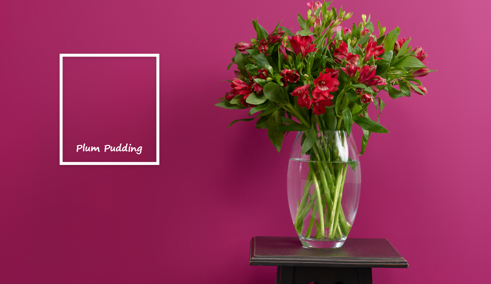
5. Purple passion
Also popping up everywhere are rich purples – velvety shades on both the violet and magenta-infused palettes. Think luxurious and moody aubergine, beautiful winter berry hues and sumptuous plum shades.
Ones to watch are Boho Berry, Boujee and Plum Pudding. They pair beautifully with greens, pinks and many neutrals.

These colours are complex and require careful handling, but bring huge rewards when used successfully. Purples like these can add a layer of depth and complexity that few other colours can achieve – find out more in our article on plum for home interiors.
6. Neutral nature
For those in team neutral, cosying up with warm biscuit and mocha shades is en vogue this season. Check out Take the Biscuit, Moleskin and Drama Llama or read more in our article on cosy neutrals.

These colours are perfect for creating a tranquil environment, offering a canvas that’s easy to layer with textures and accessories for a truly pared-back look. Above all else, they show that embracing neutral shades can still result in a cosy, homely atmosphere.
The versatility of these deeper-toned neutrals means they complement almost any décor style, from modern minimalism to rustic charm. Warm neutrals add depth and comfort, while cooler shades will open up a space, making it feel brighter and more spacious.
Pairing these hues with contrasting elements can elevate the overall scheme, creating a sophisticated, timeless look that’s full of character. Our favourite pairings include deep browns or pops of colour like mustard or deep teal.
7. Teal temptation
A sophisticated alternative to green, deep teals and jewel-toned turquoises bring a moody richness reminiscent of stormy autumn skies or evening twilight. These shades add drama and depth without feeling heavy, making them the perfect autumn paint colours for creating a statement in your home.
They work beautifully as accent walls, cabinets or even on smaller details like shelves and door frames. Pair them with plum, mustard or warm wood tones for a layered, autumn-inspired palette that feels both stylish and inviting.
At Frenchic, we have a selection of beautiful teal shades to choose from. They range from muted Anguilla, Verdigris and Calming Carol through to bold Pinch Punch and Steel Teal, not to mention deep, dark Into the Night and After Midnight.
8. A blush whisper
While they’re not traditionally autumnal, soft blush and muted pinks offer a delicate counterpoint to the season’s deeper hues. These shades bring subtle warmth and lightness, lifting a space without feeling too spring-like. Think Dusky Blush and Ballerina.
Blush works particularly well alongside rich burgundy, forest green or rustic browns, adding a gentle, sophisticated softness. Use it on walls, textiles or accessories to create a harmonious, layered autumn look that’s both cosy and contemporary.
For those seeking a touch of understated luxury, pairing blush tones with tactile finishes can make all the difference. Think velvet cushions, linen throws or matte-painted furniture to enhance their soft, comforting quality. These gentle hues also transition beautifully through the seasons, working just as well with fresh whites and greens in spring as they do with deeper, moodier shades in autumn.
Fall head over heels for autumn in your home
With these trending shades in mind, it’s easy to add depth, warmth and sophistication to your home. Whether you lean towards bold burgundy, uplifting orange or soothing green, there’s an autumn paint colour to suit every space and every mood – and you’ll find plenty to choose from at Frenchic.
Head to your local Frenchic stockist to explore our colours in person, then enjoy painting with our creamy, self-priming paints.

