


One of the great things about pink is that you can use it anywhere. But there’s still a lot to consider when you’re looking for pink room ideas and particular colour combinations. In this post, we’ll run through the colour psychology of pink in all its different forms to give you some ideas.
Colour psychology: Why pink is more than just ‘pretty’
Pink is enormously varied and versatile, depending on the shade. It has the ability to both comfort and cocoon, but also energise and inspire. This colour is equally adept at being brash and shocking – with numerous shades of pink to choose from.
Always fundamentally warm, pinks bring a certain amount of energy thanks to their red element. As we mentioned in our Rouge Resurgence article, red is associated with strong emotions and can stimulate dopamine in the brain. Remember, pink is essentially red softened with white. Sometimes this energy is quite subtle, as many pinks have cooler undertones. For example, they can be purple-tinged or have smoky grey notes.
When people wear pink, it's a statement – and the same is often true for interior design. Below, we’ll look at some of the different variations of pink and how the psychology of pink can make you think and feel.
The lighter side with baby pinks
Pale baby pinks and soft pink pastels blend well with other pinks and can act like neutrals, bringing a gentle warmth. These delicate hues are associated with nurturing, evoking feelings of love and tenderness.
While they might be associated with young girls' toys, lighter shades of pink are particularly good at alleviating feelings of anger, aggression and stress.
Blush pinks
Blush pink Ballerina and soft-toned Pinky are great options, along with peachy Sweetcheeks. Where better to use these nurturing shades than a nursery? The calming effect is the perfect fit for a space where your little ones will sleep, play and pose for plenty of Insta-worthy snaps.
Bubblegum pink
Stronger, mid-pinks bring cheerful positivity with a playful, bubblegum vibe. Add in peach and coral notes or salmon undertones for freshness. These hues can make us feel optimistic and hopeful, making them great choices for any room – particularly those with lower natural light levels.
Bubblegum pink Bon Bon, purplish Love Letter and strong pink Macaroon fit the bill.
You can read more in our guide to bubblegum pink paint.
Earthy options for interior design
Muted, earthy-toned pinks bring a sense of calm with brownish or smoky undertones. With a strong association with vintage interiors and a timeless, heritage feel, they are both familiar and reassuring.
If this sounds like your kind of pink, check out these warm hues:
-
Soothing, pinkish-beige Nougat
-
Brick-toned Dusky Blush
-
Earthy, reddish Clay Pot
Or for cooler, smoky undertones, there are:
-
Lilac infused Golightly
-
Soft Rosy Dusk
-
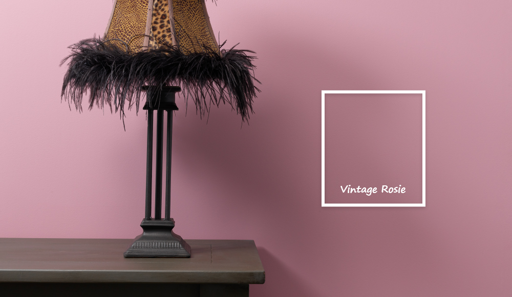
Mauve-tinted Vintage Rosie
Hot pink with attitude
Of course, there are stronger, statement hot pinks that ooze energy and vibrancy. We’re talking about magentas with their smidge of purple, plus reddish rose pinks, hot cerise and fresh watermelon.
These emotionally stimulating bold pinks often work best when their punch is tempered a little. You can partner them with plenty of balancing colours or simply use them as an accent colour.
See how Tina uses hot pink Raspberry Punch for a fabulous pop beside her Bon Bon walls…
On the other hand, they can be great for adding character and energy into rooms with lower light levels – and the brave can consider using them as the dominant colour. As well as Raspberry Punch, some good options are Hottie and Fifi’s Fancy.
More than one colour: Different shades that pair with pink
As well as having a myriad of pink shades, you have lots of variety when choosing which colours to use alongside it. Here are some of our favourite combinations and how pink relates to them:
-
Black, off-black or charcoal – A striking but fabulous, bold contrast.
-
White – Cool whites provide a crisp feel. Or add warm whites or creams for a softer look.
-
Aqua / teal – The cooler blue notes of teal balance well with any pink.
-
Cool grey – Again, cool grey tones offset the warmth of pink.
-
Mint green – Perfect with a soft or pastel pink for fresh spring or Miami vibes.
-
Peach – Being so beautifully similar, peach and pink make a winning combo.
Is there such a thing as too much pink?
It all depends on your personal taste and different moods. The psychology of pink can give you some ideas of the effects pink can have, but it's up to you to decide how different uses of the colour make you feel.
If you wear pink a lot or just love pink, you'll probably want to use it as the main colour in a room. Those without unconditional love for the colour will want to start with smaller samples throughout their homes. Perhaps pink doesn't have any profound effect on you, but you just fancy something out of the ordinary for your bedroom, living room or a statement piece of furniture.
Above all, pink is a positive colour that exudes warmth and calm. But, regardless of the overall psychology of pink, it can still have the opposite effect for people who simply don't like it!
Pick your colour: Pinks from Frenchic
Whether you’re going for light, earthy or hot pinks with punch, Frenchic offers a selection of stunning pinks that can bring your space to life. Paint furniture, walls, woodwork and more with our collection of high-performing chalk paints for a wide range of surfaces.
Put on your rose-tinted glasses and take a look at our full range of pink paint today or check out our guide to Frenchic paint ranges to find out which is right for your project.
