


Key FAQ Points:
- Painting furniture is typically less impactful on a space than painting walls, so you can be braver and more playful with colour.
- It also comes secondary to walls, so walls give you a starting point for colour choices.
- Consider colour theory and light in a room – including the overall brightness of the space.
- You can also use multiple colours, plus a range of finishes – waxed, metallic, distressed, layered, cracked and stencilled.
---
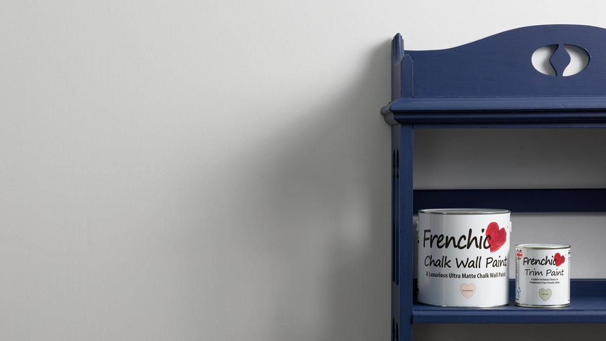
We’ve previously covered how to choose the right paint colours for your home, focusing on walls. However, when choosing paint colours and finishes for your furniture, the advice is a bit different. Keep reading to find out why and what to consider when choosing colours for your furniture.
Choosing colours for walls vs furniture
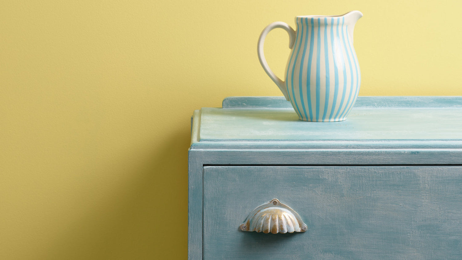
Furniture is generally less impactful than painting your walls, simply because of the size. Whether it’s a dining table, doll’s house or chest of drawers, furniture is small scale compared to your walls.
As such, painting furniture generally comes secondary to walls. Most people will pick (or have painted) their wall colour first, then choose furniture colours to complement the existing colour scheme.
As with any ‘rule’, there are exceptions. Built-in wardrobes and kitchen cupboards are very impactful due to their size. They can be treated like a wall in terms of choosing colour – unless you want them to stand out as a feature.
It’s not just about working with the colour of walls though. Furniture’s smaller size also allows you to be braver and more playful with colour. With less of an impact than walls, you have opportunities to push your boundaries. Here are some considerations:
Start with your wall colour
You don’t have to be tied down when choosing your furniture paint. But it’s undeniable that it will be impacted by other colours in your space. Whether you’re just painting furniture (and leaving your walls) or planning to paint your walls too, it makes sense to consider what colour they are – or will be.
This can provide a good starting point for the colour of your furniture. For example, if you’re looking to contrast white walls, a bold black could look great. Want to complement green? Try your favourite shade of red. This is where colour theory can come into play…
Using colour theory
Colour theory is a way of combining colours based on a colour wheel. It’s comprised of warm colours on one side (red, orange and yellow) with cool colours opposite them (green, purple and blue).
The idea is that colours opposite one-another provide balance, making them a good combination. So, yellow furniture might be a good match if you have blue walls, for example. Another option is to use split complements, where you use the next colour along to whatever is opposite. For example, red and purple.
Alternatively, you can pair colours that are next to one another on the wheel, such as blue and green. These are known as analogous colours, offering a more subtle appearance than the other contrasting options.
Remember – not everything has to be a full frontal red, green or blue. There are plenty of beautiful neutrals with subtle undertones of different colours for you to play around with.
Light (and natural light)
Another factor is how light a room is. This has two meanings – the brightness from the existing colour and the natural light coming into the room.
If your room is painted with off-white walls, for example, you might want darker furniture to add some depth. On the flipside, a room that’s dark and moody could benefit from some lighter accents to bring it to life.
In terms of natural light, warm colours often work best in rooms without much natural light. But if you’ve already applied this idea on your walls, you can probably get away with furniture in other colours.
Using multiple colours
Let’s not forget that furniture doesn’t have to be a single colour. There are some fantastic examples of multi-coloured furniture, including chests of drawers with the drawers contrasting the chest, chairs in different colours to the table or just cabinets with an additional pop of colour on the handle.
This is especially effective in rooms using neutral colours, creating a statement piece that really catches the eye. But don’t let us stop you creating a multi-coloured wonder in a room that’s already full of character!
Choosing finishes for furniture
You might be content with a smooth, pared down look for your project, but one of the many joys of painting furniture is the added fun of choosing different finishes to give your piece even more personality. In this case, it’s simply a choice of choosing your favourite…
Waxed
Firstly, there’s wax. This can have a variety of effects depending on the type of wax you use:
- Clear Wax – Enriches and deepens the colour of bare wood or traditional-style chalk paints like the Original Artisan range.
- Defining Wax – This grey wax highlights and defines any texture, panelling or detailing to add depth.
- White Wax – Tones colours down for a French country look, bleached appearance or limed effect on bare wood.
- Browning Wax – Darkens and ages wooden or painted furniture.
Metallic
Metallic powder can add some real pizzazz to decorative details, handles or even an entire table-top if you so desire! Simply mix Frensheen powder with a top coat or wax – the more you add, the bolder the effect will be. Check out our Frensheen guide and video for more information.
You can also try our Metallics and Frenshimmer ranges, which give you a metallic effect as you paint.
Distressed
If you use a traditional style chalk paint like our Original Artisan paints, you can create a multitude of effects by distressing the surface before sealing. Use steel wool or sandpaper to distress edges, corners and high-touch areas for a natural aged look. Find out more in our guide to distressing.
Layered
You can also layer colours using the distressing approach above. In this case, Original Artisan paints can be layered on top of one another, so the base colour shows through when the top is distressed. Other self-sealing ranges can also be used for this. Choose contrasting colours for the best effect.
Cracked
A cracked effect is another way to give furniture an aged appearance. Apply Frenchic Easy Crackle after applying your base coat of paint and leaving to dry. When you add a second colour on top of the dried Easy Crackle, it creates a stunning cracked effect. Seal with Finishing Coat or wax, as explained in our cracked-paint guide.
Stencilled
Let’s not forget stencils! Choose from a selection of stencil designs to add patterns and effects to any piece of furniture, plus an extra pop of colour.
