


Even if you don’t think of yourself as an artistic person, chances are you’ve encountered a situation where you’ve had to select colours for something. Whether you are looking to paint the walls in your new home office, upcycle furniture or hand make a child’s toy, you’ll need to consider what colours work best.
Choosing complementary paint colours doesn’t have to be difficult. Here’s what you should know about colour theory to make smarter decisions when it comes to painting.
The colour wheel
The colour wheel consists of six basic colours in a pie-chart formation. Red, orange, yellow, blue, green and violet make up the wheel. Red, blue and yellow are primary colours. With a combination of these colours, you get the rest. Orange, green and violet are what’s known as secondary colours. There are also tertiary colours, such as red-violet and blue-violet which are created by mixing a primary colour with a secondary colour.
Warm and cool colours
When divided in half, the colour wheel separates out warm and cool colours. Red, yellow and orange make up the warm side of the wheel, while green, blue and violet are the cool colours.
With warm colours, we tend to think of warm elements, such as sunlight and heat. These colours remind us of the sun, energy, joy and happiness. On the flipside, blue, green and violet tones calm and soothe. They remind us of nature, the sky, water, and even ice and snow.
Although it sounds basic in theory, there are many colours in the spectrum that can tip the scales. Green and purple can be considered transition colours. This is because they can both be warm or cool, depending on their balance.
If the purple has more red in it than blue, then it can be considered a warm colour. If there’s more blue, it can be a cool colour. Similarly, if there’s more blue in a green colour, it could be considered cold. On the other hand, more yellow can make it a warm green. Simple, right?
Complementary colours
Complementary colours are any two colours on the colour wheel that are opposite each other – red and green, blue and orange, yellow and violet.
- Red’s complementary colour is green. Green is made up of a warm yellow and a cool blue.
- Blue’s complementary colour is orange. Warm yellows and reds create orange.
- Yellow’s complementary colour is purple. A cool blue and a warm red create purple.
Complementary colours create a high contrast, allowing both colours to boldly stand out and work well together. When you want a key feature to stand out, use complementary colours of your choosing. Alternatively, you can play with tints and shades. For example, use a lighter tint of blue (think pastel blue) contrasted with a darker orange (such as burnt amber).
Split complements
Another key to choosing paint colour is to use split complements. This is where you use one colour, say blue, and instead of using its direct complement colour (orange), you use the next colour along. This would mean you use blue and yellow-orange. This creates a good visual balance, but also adds a bit more interest.
Stunning complementary paint colour schemes
Paint colours that complement each other make for a bold and beautiful interior space. But that doesn’t mean you need to deck your house out with red and green walls. Take a look at just a few stunning complementary paint colours that you can incorporate into your furnishings, wall paint and more.
The soft and gentle orangey-pink hue of the peach pairs well with a striking turquoise blue. The mixture of cool and warm tones adds major contrast, while complementing each other nicely.
Introduce these romantic and feminine colours into your house. Pale green paint with a hint of grey adds an earthy and tranquil feel, while the bold and bright pink adds vibrancy and energy into the space.
- Powder blue and tangerine
Blue and orange work well together in a range of domestic and commercial spaces. If you’re looking for the bold combination without the bright colours, then try a soft pastel blue with a punchy tangerine. Incorporate these two paint colours into your white space through painted furniture for a balanced, stylish finish.
A muted purple, such as lavender, along with a gentle yellow-orange with grey undertones make for a subtle colour scheme that is perfectly balanced. Paint a table lavender and the chairs amber for a dining room with a bit of interest.
Pure jewel tones within a living space is truly daring. But done right, it is pure glamour. Mix in cherry red furnishings against emerald green tile or walls. For vintage luxury, this colour combo can’t be missed.
Duck egg blue is a beautiful mix of green, grey and blue that is versatile enough to work well with a variety of colours from whites to browns to pinks. To inject a bit of heat into the cool colour, try a sunny yellow for an accent colour.
Complementary colour rules to keep in mind:
- For the best results, stick to complementary and split complementary colours. Analogous colours (colours next to each other on the wheel, for example, blue, green and yellow) also work well paired together.
- More than one colour in a single room can look great, but don’t go overboard. Keep it to three colours maximum. If you choose two bold colours, the third should be something neutral to give your eyes a break.
- Start by choosing your boldest colour. Select your other colours with the first one in mind.
- Don’t be scared! Paint isn’t permanent and you can always change it.
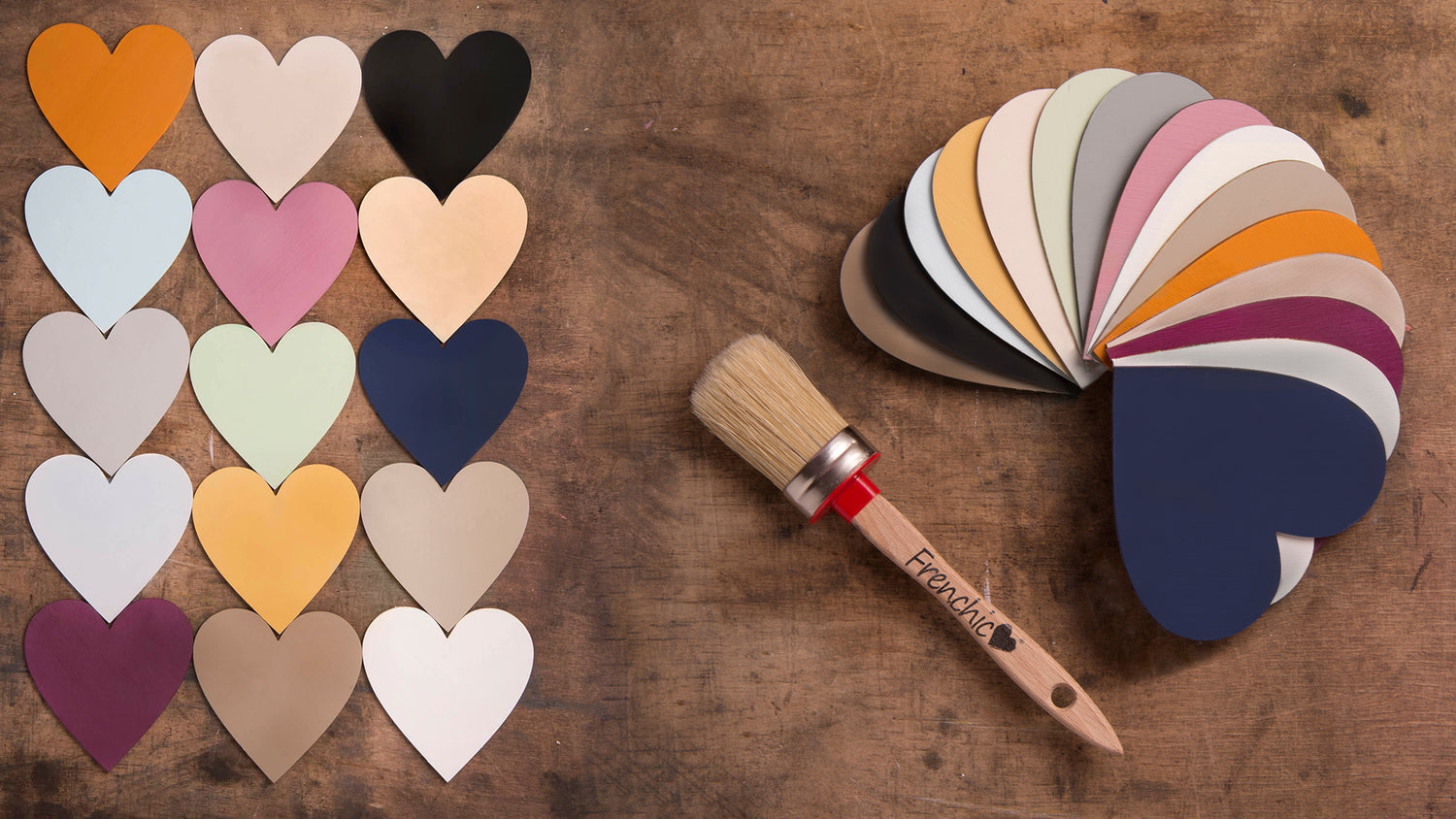
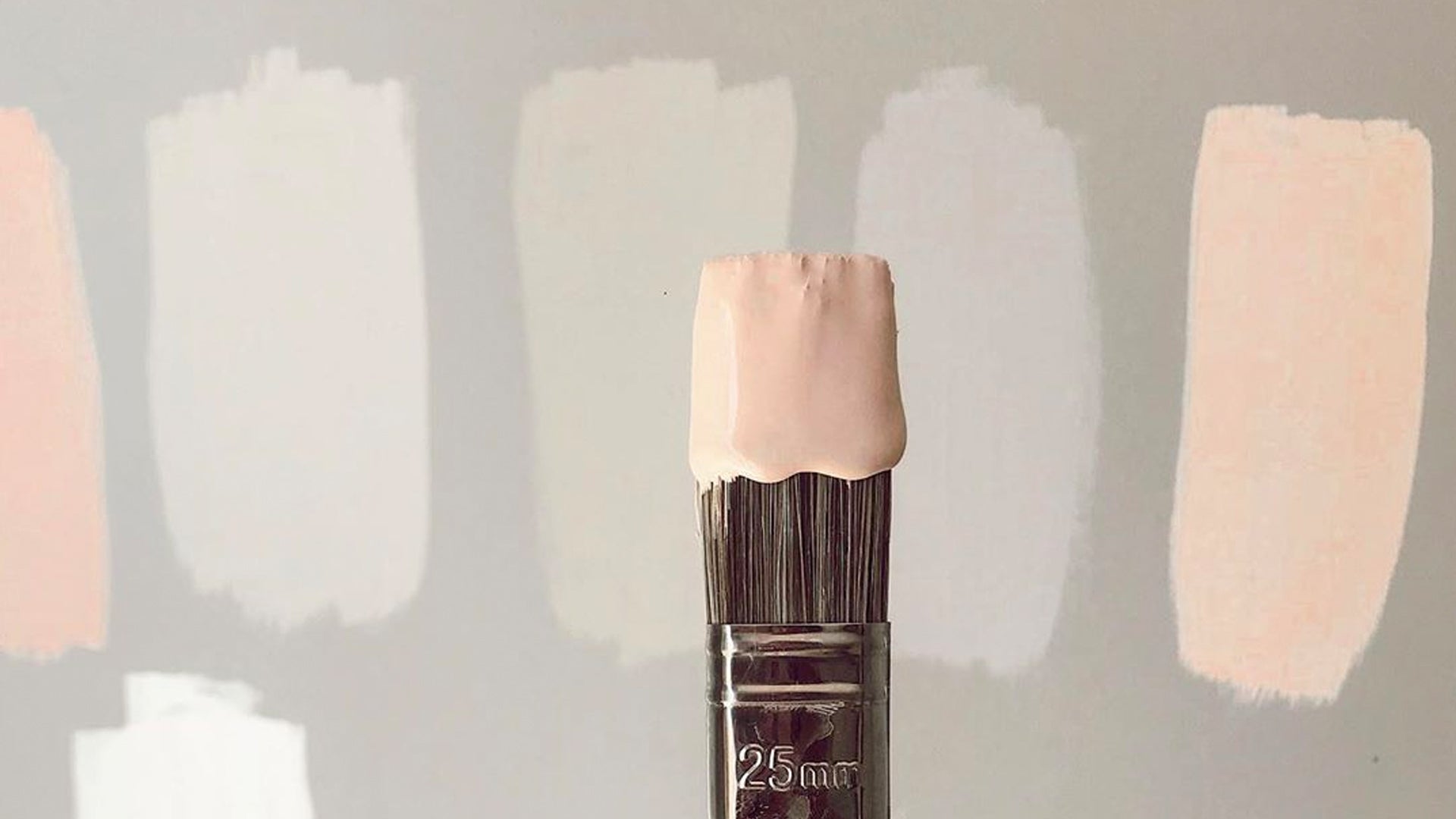
Have fun with chalk paint
Chalk paint is all the rage – and for good reason too. It’s easy to apply, leaves a stunning finish and can be applied to your walls, furniture, tiles and children’s toys. At Frenchic Paint, we have a wide selection of paint colours that we continue to add to on a regular basis. Whether you’re looking for that spicy red to complement a sage green, or a muted purple for a bright yellow feature, we have the paint you need.
If you’re new to chalk paint (welcome!), try our ‘paint and go’ range that requires no priming, buffing or sealing. We know you’ll love our chalk paint as much as we do.

