


While you might not realise it, colours and emotions are closely linked. Colours have the power to trigger emotions in us, and these reactions are rooted in psychological effects, biological conditioning and cultural imprinting.
That’s why it’s so important to understand colour psychology and choose colours wisely when it comes to decorating. Certain paint colours can be used to create a lively and energetic mood (ideal in the kitchen or living room), while others can evoke calmness and relaxation (in the bedroom or bathroom, for instance).
If you’d like to use colours strategically throughout your house to represent emotions or influence moods, here is what you should know about colour psychology.
Cool vs. warm colours
On a simple colour wheel, you’ll find six basic colours. When you divide the wheel in half, you have three warm colours and three cool.
Warm colours:
- Red
- Orange
- Yellow
Cool colours:
- Green
- Blue
- Purple
On a basic level, warm colours are associated with sunlight and heat, which can be used to evoke energy, optimism and warmth into a space. Cool colours, on the other hand, remind us of nature, water and the sky. They hint at peacefulness and calmness, but can also express sadness.
How colours can make you feel
Red
Red is the warmest and most dynamic colour, and it can trigger emotions and commands attention easily because of its boldness. While it can make you feel passionate and energised, it also has connotations of danger and anger. Studies have found that red can increase your metabolism and consequently your appetite.
How to use it? If you want to draw attention to a design feature or create a statement piece, use red. However, too much can be overwhelming. Use it in moderation, tone it down with other deep colours, or apply a darker or browning wash or wax to temper its heat. Red paint works well in dining rooms, living rooms and other spaces where people gather.
Orange
As a blend of red and yellow, orange naturally adopts characteristics of both. Like red, orange is a bold colour that is full of energy. Like yellow, it’s warm and friendly. Orange can make us feel energised, creative and enthusiastic, and orange hues tend to be balanced and inviting.
How to use it? Orange shades are great for splashes of interest and accents, as well as being great for complementing other colours. But they can be dizzying when used as the dominant colour. Hints of orange are best used in exercise rooms or home gyms because of the colour’s ability to get you moving. It also works well in kitchens and dining rooms.
Yellow
Yellow is simply happy. It’s been long associated with positivity, laughter and sunshine. This hue is stimulating and makes everything feel light and sunny, for a calming psychological effect. On the flip side, it can also be perceived as abrasive when used in the wrong context. While soft yellows work best to convey a cheery atmosphere, bright or acid yellows or too much yellow can trigger caution.
How to use it? Work to find the right shade of yellow, use it sparingly and consider combinations with other complementary colours. This hue tends to work best in kitchens, dining rooms and bathrooms.
Green
As one of the most natural pigments, green is the easiest on the eyes. It represents balance and harmony, as well as growth and renewal. Lighter shades of green with a mix of yellow are more cheery and light. Darker and deeper greens represent stability, safety and wealth. With the addition of blue, greens become more like teal and take on cooler tones. Its ties with nature help us to feel less stressed and more relaxed.
How to use it? Green paints have a wonderfully calming effect when used as the dominant colour for decorating. Green walls and furniture tend to work best in bedrooms, bathrooms, living rooms and other spaces where you want to promote comfort and peace.
Blue
The calming light blue sky, the depths of the oceans, the sparkling lakes and streams – blue hues remind us of natural elements. This colour is often touted to have calming psychological effects and to slow down respiration and blood pressure.
However, a pastel blue that looks reminds us of the clear sky can come across as cool on walls and furnishings. Light blues tend to work best in a room that receives ample natural light. If that’s not possible, then balance the coolness within the blue with warm hues in furniture and fabrics. Darker blues emit feelings of knowledge, power and trust and can work well as a dominant pigment in a space.
How to use it? To utilise blue’s calming effects, use warmer shades such as periwinkle or turquoise in social areas. Navy blue works best in home offices to evoke an air of professionalism.
Purple
A blend of blue and red, purple can take on different forms depending on the shade you use. As one of the most versatile colours, you should consider what feelings you want to project into a space. Lighter shades of purple, such as lavender, work similarly to blue, evoking feelings of relaxation and rest but without the chilly feel. Darker shades, such as aubergine, take on some of red’s energetic notes, creating drama, sophistication and luxury. As an accident or secondary colour, it gives your scheme depth.
How to use it? Lighter shades of purple work well in bedrooms while darker shades are great for dining rooms. Incorporate elements of purple in any room you want to add luxury.
Black
Black absorbs all light on the colour spectrum and represents the absence of colour. Generally, the colour black is associated with power, elegance and mystery, but it can lend different meanings in different contexts. For example, it can trigger emotions of fear and the unknown, or it can be used to create drama and elegance.
How to use it? Black is best used carefully to prevent a room from creating a dark and melancholy mood. Use black paint for showcasing accent pieces, highlighting other colours in the room and to give depth to your colour scheme.
White
In contrast to black, white reflects light and, therefore, is the presence of all colours. As a result, it complements every shade, tone and hue there is. White paint creates a blank canvas, offering a minimalistic and simple look. While it can give your space an open and airy feel, too much white can be too clinical and stark.
How to use it? Create a contemporary feel by using white paint in the kitchen. Use white walls and accent features to create the impression of more space and make other colour choices pop. An off-white colour, such as cream, creates a softer contrast.
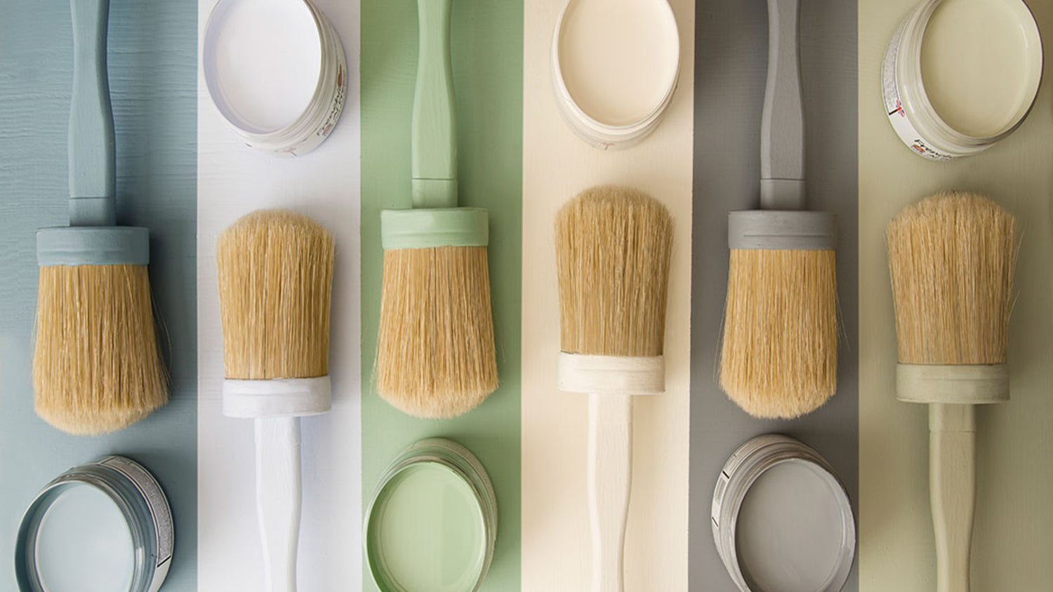
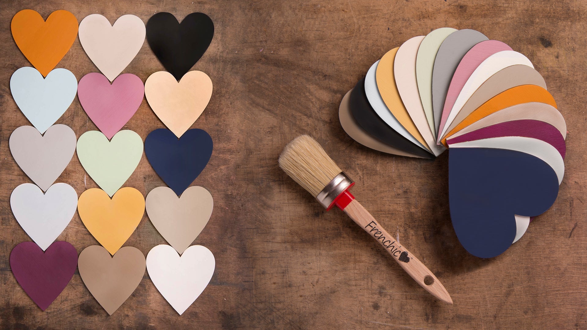
Get chalk painting
Try your hand at painting colours representing emotions. At Frenchic Paint, we have a wide selection of chalk paint colours all with minimal VOC content for virtually no smell. Whether you’re painting walls or upcycled furniture, we have the paint and tools you need.
