


As we step into the summer months, there’s a noticeable move away from soft, blended palettes towards shades that feel clearer, more defined, and more deliberate in how they’re used. It’s less about filling a space with colour, and more about placing it with intention.
What’s coming through this season is contrast and control. Fresh greens that feel sharper than last year’s sage, blues that are cleaner and more direct, and warmer tones that bring energy without tipping into heaviness. These colours aren’t background. They’re functional. They’re being used to highlight, to shape, and to give a room a sense of direction.
Rather than reworking an entire space, the focus is on introducing colour in a way that feels considered, whether that’s through cabinetry, furniture, or architectural details. It’s about allowing each shade to hold its own without competing.
Read Frenchic Colour Consultant Jen’s key colour directions for summer, and how they’re translating into interiors right now.
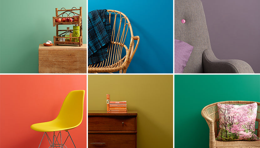
Apple Green

Frenchic shade: Apple of my Eye
Apple Green feels like a step on from softer eucalyptus and sage tones. It’s fresher, sharper, and more energetic, which is why it’s been so visible in fashion and is now edging into interiors. Apple of My Eye captures a modern clarity without feeling harsh. It has enough brightness to feel current, but it still holds its shape in a room. I’d use it as a feature colour on cabinetry, furniture or a single wall. Anywhere you want a space to feel awake and intentional rather than decorative.
Cobalt Blue

Frenchic shade: Pinch Punch
This is a confident, blue-blue rather than denim or navy. Pinch Punch has that cobalt strength, which is clean, direct and unapologetic, and it works well as an accent. It’s not a colour I would flood a room with, but it’s brilliant when you want impact. I would use it on doors, shelving or architectural details where it can do its job without overwhelming everything else.
Violet

Frenchic shade: Velvet Crush
There’s a noticeable shift away from burgundy and wine tones towards violet-based purples. Velvet Crush sits firmly in that space. It adds mood and depth, but without the heaviness that deeper purples can bring. It’s a colour that feels considered rather than dramatic. I like it in spaces where atmosphere matters, bedrooms, dining rooms or smaller rooms where depth actually enhances the feeling of the space.
Jade

Frenchic Shade: Irish Dance
Jade tones sit beautifully between fresh and grounding, which is why they’re working so well right now. Irish Dance strikes that balance of calm and slightly cool, but still interesting. It’s one of the few colours here that can work as more than just an accent. I’d happily use it on full walls in living rooms or bedrooms where you want something more characterful than a neutral, without tipping into bold.
Wasabi

Frenchic Shade: Pea Soup
This is a more design-led direction than classic yellow. The yellow-greens feel sharper, more modern and a bit unexpected. Pea Soup is bolder and greener; Citrine slightly lighter and brighter, but both work best with restraint. I see these as accent colours for furniture, doors or shelving, used to add energy and contrast rather than as background shades.
Persimmon

Frenchic Shade: Sundowner
Persimmon sits firmly in the red-orange family, warmer and brighter than rust or terracotta, but still grounded. Sundowner captures that late summer warmth beautifully. It’s lively without feeling aggressive and brings a sense of sociability to a space. I’d use it where you want warmth and connection like kitchens, dining areas or spaces that come alive later in the day.
Want to refresh your outdoor spaces for the summer season? Check out our full Al Fresco Range and read our eight handy tips for painting outside or our tips on painting a composite door.

