


Sitting between cream, oat and pale sand, Linen carries the ease of sun-bleached fabric and the understated elegance of natural fibres. Inspired by flax textiles, linen translates into a beautifully balanced paint colour. It's neither too yellow nor too grey, making it one of the most versatile neutrals to work with. It softens a space without feeling flat, creating warmth while maintaining light.
Part of its appeal lies in how it responds to light. In the morning it feels fresh and creamy, by afternoon it warms into soft sand and by evening it becomes more cocooning. In a world that has leaned heavily into bold interiors, designers are quietly returning to linen, a soft, warm neutral rooted in nature.
Psychologically this places linen within the realm of soothing, grounding colours which is ideal for spaces where you want the nervous system to settle.
Linen also works effortlessly with natural materials. Pair it with raw wood, stone, plaster, ceramics and woven textiles to bring depth and texture to the surface. Frenchic Colour Expert Jen Devaney shows how to pair it.
In the Frenchic Palette
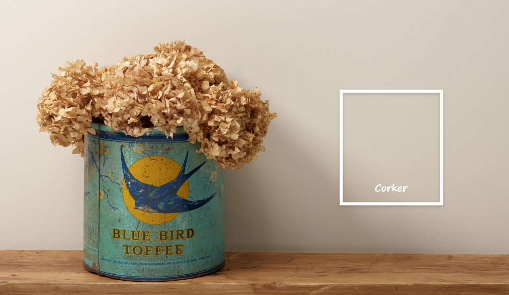
Within the Frenchic range, linen can be interpreted in different depths. A lighter linen reflected in Parchment and a slightly deeper, warmer linen seen in Corker.

Linen is what I often call a bridge colour. It doesn’t demand light, and it doesn’t collapse without it, it adapts.
Where to use it:
- In hallways, Linen works beautifully as a transitional shade, soft in natural light, yet warm and grounding in its absence.
- In kitchens, it offers a clean yet softened alternative to white, pairing effortlessly with timber, stone and painted cabinetry.
- In bedrooms, linen creates a soft brightness, gentle in the morning and quietly cocooning by evening.
- Understated, tactile, and timeless, linen proves that the softest colours often do the most work.
Pairing ideas:
Linen’s strength lies in its ability to shift through tonal layering.
For a modern look:
Pair it with crisp contrasts and clean anchors such as fresh whites, charcoals and softened blacks like Frenchic’s Wedding Cake, Donkey Derby and Dark Horse. These combinations create a refined, architectural feel. They are sharp yet still softened by linen’s warmth.

For a contemporary feel:
Layer linen with warm, nature led tones such as muted olives, clay rich terracotta and softened greens like Constance Moss, Earthy and Apple Barn.
These pairings bring depth and movement while keeping the palette grounded, relaxed and current.

For a soothing, grounding space:
Combine linen with deeper neutrals, gentle browns and dusty blues such as Moleskin, Calming Carol or Hebrides.
These tones enhance linen’s calming quality, creating a space that feels settled, cocooned and effortlessly restful.

Each combination draws out a different side of linen, from clean and structured to warm and layered, or soft and restorative, showing just how adaptable this quiet neutral can be.
Try adding the warming new neutral shade of linen to your home for a natural, calming feel. Shop all our neutrals or find your local Frenchic stockist to get started today.

