




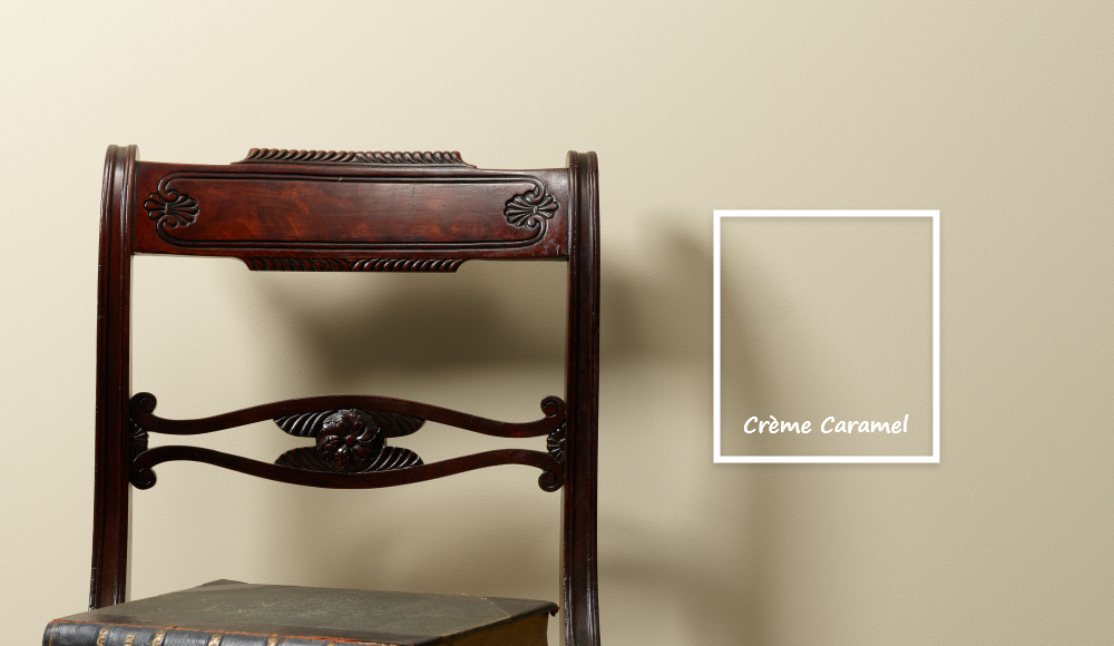
There’s something undeniably comforting about caramel. Not just in taste, but in tone. It’s a colour that holds warmth without shouting, which carries depth without darkening. In the home, caramel shades are having a moment but it’s not just a trend. It’s a return.
Caramel, as a colour family, sits at the crossroads of golden yellow, soft orange and warm brown. It’s the result of natural alchemy, where light meets earth, and sweetness meets structure. These hues evoke memory, comfort, and a subtle luxury that feels grounded and lived-in. Think aged toffee, sunlit timber, sand-washed cotton, and old honey jars.
What makes caramel so magnetic is its emotional range. Each tone in this family holds a particular energy. Golden-yellow caramels bring uplifting light, joy, and clarity. Orange-based caramels add warmth, creativity, emotional expression, and flow. While soft brown caramels are the anchor of depth, and connection to the earth.
Together, they create colours that feel like home. Read Frenchic Colour Expert Jen Devaney’s five Frenchic favourites from the caramel spectrum each with their own mood, personality, and style pairings.
The Signature Hue

This is classic, velvety caramel. Its soft, inviting, and endlessly versatile. It’s that gentle in-between.... richer than cream, lighter than tan. There’s something comforting and timeless about it, like buttered toast.
Use it in:
Living rooms, hallways, or dining areas where you want to create connection and calm.
Pair it with:
Warm whites for a soft monochrome scheme. Olive greens for a nature-inspired palette. Brushed brass or copper accents to deepen the glow.
Style it with:
Natural linens, boucle, and earthy textures or mid-century or warm minimalist interiors.
The Soft Ground

Granola is an easy, oat-toned neutral with a hint of warmth. Not too beige, not too yellow. It feels fresh, modern, and gently grounded. Think rolled oats at sunrise, or a soft knitted throw that’s been well-loved.
Use it in:
Granola works beautifully in kitchens, home offices, or open-plan rooms. It adds quiet warmth without pulling focus and is great as a whole-room base.
Pair it with:
Matte black hardware for contrast. Softer greys or slates for a modern palette. Pale woods and natural stone.
Style it with:
Scandi simplicity or soft contemporary spaces.
The Natural Neutral

Pampas is your dry grass tone inspired by the feathery plant it’s named after. It’s slightly earthier than cream and carries a hint of desert sand. Airy, organic, and calming.
Use it in:
Pampas is ideal for bedrooms, calm lounges, or creative studio spaces.
Pair it with:
Sage greens (like Wise Old Sage). Terracotta or soft peach tones.
Style it with:
Boho, vintage, or slow-living aesthetics. Soft, layered textiles, macrame, and dried botanicals. Rattan, cane, or bleached-wood pieces.
The Golden Edge

Honeycombe brings in that spiced warmth, a slightly deeper, mustard-infused version of caramel that still holds light. It’s joyful and nostalgic, like the glow of the late afternoon sun on a painted wall.
Use it in:
This shade looks beautiful in kitchens, cloakrooms or as colour blocking against neutral walls. Use on doors, cabinetry, or feature walls for a pop of golden earthiness.
Pair it with:
Slate greys or deep teal, blues for contrast. Dusky Blush for a modern retro vibe. Dark wood or vintage metal.
Style it with:
Eclectic 70s-inspired, or artisan-style interiors.
The Modern Classic

This one toes the line between warm beige and soft brown. Understated, confident, and quietly stylish. It feels refined, versatile, and surprisingly contemporary.
Use it in:
Take the Biscuit works beautifully in hallways, studies, or bedrooms.
Pair it with:
White or off-white trim for freshness. Darker tones like Cool Beans or Panther for bold contrast. Soft pinks or muted greens for something gentler.
Style it with:
Heritage-inspired, transitional, or modern traditional interiors. Pair with textured fabrics and gallery walls for a look that’s both curated and lived-in.
Top Tip:
Caramel tones don’t just decorate, they ground. These colours work like the bass note in a melody. They support other shades, balance the energy in a room, and add a touch of softness without slipping into blandness.
If you’re unsure about bold colour but want more than white or grey, then this is your middle path. Caramel is colour with soul.
Try adding a warming neutral shade to your home, with our full neutral collection. Or find your local Frenchic stockist to get started today.