


Come the summer months, the light changes first. It’s sharper, longer and more revealing and with that, the way we use our spaces begins to open outwards. The garden, terrace, or balcony is no longer separate from the home, it becomes part of it. Colour plays a different role outside.
It doesn’t sit still. It moves with the light, softens in the shade, sharpens in full sun and interacts constantly with planting, materials, and sky.
Using the five new limited-edition Al Fresco shades as a starting point, colour expert Jen Devaney designed these palettes to help you shape that experience. Each one is built around a different outdoor atmosphere with supporting colours that ground, lift, and balance.
1. Sun-Washed Mediterranean Coast
This palette is built around warmth and air.
Clay Pot brings that sun-baked, earthy tone. It's a soft terracotta that feels settled rather than bright. It holds heat visually without becoming heavy.
Wedding Cake opens everything up. A chalky, soft white that reflects light back into the space and creates that slightly sun-bleached feel you see across Mediterranean walls and coastal homes.
Ol’ Blue Eyes introduces a gentle contrast. A muted, slightly greyed blue that reads as sky rather than colour. Soft enough to sit, but strong enough to lift.
In full sun:
Clay Pot warms and softens, Wedding Cake brightens, and Ol’ Blue Eyes lifts the palette into something airy and relaxed.
In shade:
Clay Pot deepens, the blue becomes calmer, and the white keeps everything from closing in.
Where I’d use it:
- Clay Pot on planters, feature walls, doors and frame structures.
- Wedding Cake on larger surfaces, walls and furniture bases.
- Ol’ Blue Eyes on shutters, seating and smaller accents.
Why it works:
It mirrors the natural balance of heat and cool, think earth against sky, which is why it feels effortless.
2. Heritage Country Garden
This palette is about softness with structure.
Bradstock sits in that perfect middle ground. This green feels natural, slightly muted with a blue-grey undertone so it never becomes too bright.
Swanky Pants anchors the palette. A warm taupe that gives stability and stops the overall look from becoming too decorative.
Dusky Blush brings a quiet layer of softness. A faded pink that feels like it belongs, more like a petal than a paint colour.
In full sun:
Bradstock lifts slightly greener, Dusky Blush warms, and Swanky Pants keeps everything grounded.
In shade:
The green softens, the pink becomes more powdery, and the taupe holds the structure.
Where I’d use it:
- Bradstock on fences, doors and larger furniture.
- Swanky Pants on walls, base structures and planters.
- Dusky Blush on benches, pots and smaller details.
Why it works:
It feels layered and lived-in. Nothing is overly defined and everything settles into place naturally.
3. Nordic Outdoor Calm
This palette is about quiet and balance.
On a Whim is a shifting neutral. It's sometimes creamy and sometimes softly green which gives it movement without shouting.
Smoke Signal builds a mineral base. A warm grey that grounds the palette and connects it to natural materials like stone and wood.
Smudge adds depth. A soft charcoal that replaces black, creating contrast without harshness.
In full sun:
On a Whim becomes lighter and warmer, almost glowing. The greys stay soft, allowing the space to feel open.
In shade:
The green undertone becomes more visible, and the palette feels more enclosed and calm.
Where I’d use it:
- On a Whim on walls and large furniture pieces.
- Smoke Signal on flooring elements, planters and structures.
- Smudge on trims, doors and contrast details.
Why it works:
It removes visual noise. Everything is intentional, but nothing competes.
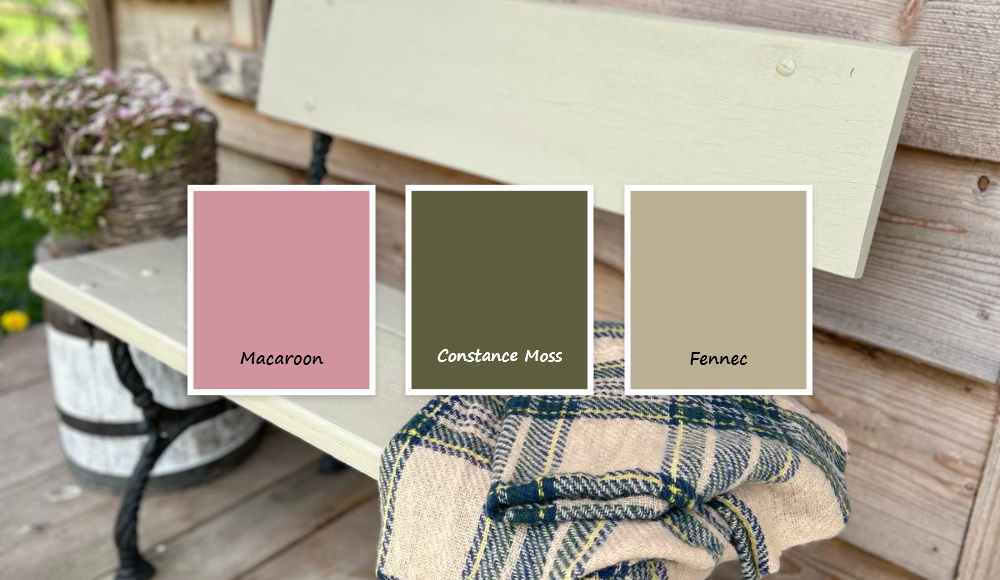
4. Bohemian Garden
This is a palette built on expression but is grounded.
Macaroon is a warm, slightly muted pink. It has enough softness to sit comfortably, but enough colour to bring personality.
Constance Moss anchors it. A deeper, earthy green that connects everything back to the natural surroundings.
Fennec softens the palette. A sandy, warm neutral that allows the stronger tones to move without clashing.
In full sun:
Macaroon becomes brighter and more playful, Fennec warms, and the green deepens for contrast.
In shade:
Everything settles down. The palette becomes more earthy and grounded but still expressive.
Where I’d use it:
- Macaroon on doors, feature furniture and statement pieces.
- Constance Moss on larger furniture and backdrop elements.
- Fennec on walls.
Why it works:
It allows freedom, but everything is tied together through warmth and earth.
5. Playful Colour Garden
This palette is about energy and contrast.
Hot as Mustard leads as a rich, warm yellow that immediately draws the eye.
Kiss Me Sloely brings structure through contrast. A strong cobalt blue that sharpens the palette and gives it intention.
Dazzle Me! creates space. A crisp white that allows the colours to breathe and prevents them from overwhelming.
In full sun:
The yellow becomes vibrant, the blue intensifies, and the white reflects everything back into the space.
In shade:
The yellow deepens, the blue holds it, and the white keeps the palette from becoming heavy.
Where I’d use it:
- Hot as Mustard on front doors, planters and focal points.
- Kiss Me Sloely on smaller furniture, accents and contrast features.
- Dazzle Me! on larger surfaces, walls and balancing areas.
Why it works:
It’s bold but controlled. The contrast is intentional, not chaotic.
The mood
Outdoor spaces aren’t just seen, they are felt. The way colour reacts to light, shifts through the day, and sits against natural surroundings changes how a space is experienced. These palettes aren’t about choosing colours in isolation. They’re about creating a space that holds together in full sun, in shade and everything in between to create an outdoor space that you will enjoy in the seasons to come.
Take your garden from drab to fab with our new Al Fresco limited-edition colour palettes. Shop all our Al Fresco shades or find your nearest Frenchic stockist to explore the colours in person today.
