


While some trends come and go, the affinity for earthy colours is here to stay. Want to find out more about the trend and how to use it in your home?
Read on as we explore the different earth tones out there, why they’re so popular, and provide a bit of inspiration using Frenchic earth-tone paints.
What are earth tones?
For anyone who’s unfamiliar with earth tones, the clue is in the name. They actually cover the entire natural palette of colours the earth has to offer, from mossy greens and blue-greys to golden ochre.

In this article, we’ll be focusing on brown-based colours that echo the natural shade of the earth itself. We’re not talking about the green and blue of the globe – but the beautiful rich brown you get when you break ground.
Think that’s a narrow scope? Think again. Brown itself can range from light pastel tones such as sandy Fennec to rich, dark shades like Liquorice, which add a hint of warmth that blacks and off-blacks often lack. Not to mention mid-browns like Take The Biscuit and Moleskin, which are characterful, warm and rich.
But dig a little deeper (pun intended) and you’ll find a plethora of brown-based greys, off-whites and even reds, pinks and purples, including:
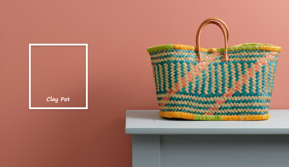
- Clay Pot – A soft, pinkish red with an earth feel.
- Dawlish – An earthy red underpinned by rich brown umber tones.
- Swayed – Café-au-lait in colour with a subtle purple hint.
- Donkey Derby – A soot-toned deep brown sitting somewhere between chocolate and charcoal.
- Smoke Signal – A warmish neutral brown with smoky grey undertones.
Why is earth-tone paint on-trend?
The liking for earthy tones has been ongoing for many years as people seek calm and grounding in their homes. Rather than on trend, per se, earth colours are a timeless option, which support wellbeing and mental health through thoughtful design.
In recent years, that’s been paired with a rise in popularity for gardening. For example, a recent survey found that over 70% of 18 to 35 year olds are interested in gardening. People are connecting more with the earth, making natural colours an easy choice at home.
While they might seem like a minor character, look closer and you’ll see how brown shades have continued to dominate throughout the years!
What colours do earth paint colours work with?
Natural and often neutral, earth-tone paint can pair with practically any colour scheme in both contemporary and classic spaces.
The myriad of brown-based grey tones can be paired with all kinds of colours, depending on the type of grey in question. As covered in our blog post on pairing paints with grey, soft greys can work well with a dusky pink, bright red, sage green, blues and even black. On the flipside, darker greys are the ideal backdrop for small amounts of bright colour.
Alternatively, you can pair colours based on their undertone. A subtle, soft red like Clay Pot, for example, can work well alongside a stronger red if you want to tone down a colour drenching scheme. Equally, however, it would look great as a contrasting accent against blue and grey tones.
Keep in mind that these are only suggestions – what works for you is the most important factor. If you’re looking for more ideas, check out our blog post on how to pick complementary paint colours.
How to use earth-tone paint colours
Because there are so many shades to choose from, you can easily pick an earthy colour to suit your needs. If you want to go subtle, a grey or pink with brown undertones can work wonders. Or jump into the nature-inspired trend with an earthy brown shade.
The same approach applies when it comes to what you’re painting. You can easily add earthy touches with small pieces of furniture, complemented by soft furnishings in earthy colours. Or go all in by painting walls or larger pieces of furniture like wardrobes and cabinets.
That applies in rooms throughout the home too. The calming influences of earthy colours are ideal for the bedroom, creating a relaxing sanctuary. That’s demonstrated perfectly using our earthy neutral, Corker…
Equally, however, earthy colours look great in the bathroom. That could be a subtle choice like Salt of the Earth to freshen up a bath panel…
Or you can go bold with rich browny-red Dawlish on your bathroom tiles. Be sure to check out our guide to painting ceramic tiles if this is up your street.
If you want people to notice the earthy tones as soon as they walk in, why not paint your hallway in a brown-based colour? If you’re stuck for which to choose, you can always order a few Peel & Stick samples!
Using earth tones in real spaces
Just a few more tips before you dip your brush in your chosen earth-tone paint. While earth paints are inherently warm and grounding, the way they behave in a room also depends on light, space size and texture. Understanding these factors can help you avoid spaces feeling flat or heavy.
The importance of lighting
Natural light plays a key role. South-facing rooms get warmer light throughout the day, meaning earthy colours tend to glow. This brings out their richness and depth. With that in mind, you can comfortably use deeper browns, clay reds or warm greys without the room feeling gloomy.
On the flipside, north-facing spaces have cooler light that’s more subdued. So, earth tones can appear darker or greyer. In these rooms, you might be best with lighter or mid-toned shades. Or you could balance deeper colours with plenty of pale surfaces and reflective finishes.
Related reading: Best Paint Colours for North, South, East & West Facing Rooms
What about size?
Despite common misconceptions, darker earth tones don’t necessarily make a room feel smaller. But they can make it feel cosier. Used thoughtfully, rich browns and earthy reds can create an enveloping, intimate atmosphere. It works beautifully in bedrooms, snug living rooms and hallways.
If you’re concerned about scale, consider using darker shades on a feature wall or on furniture rather than all four walls. Another trick is to paint the lower half of the room using darker shades, which can create the impression of more space. You can read more on this in: How to Make Half and Half Painted Walls Work.
Don’t forget texture
Texture is where earth tones really come to life. Natural materials like wood, rattan, stone and linen enhance the organic quality of earth paint. You’ll also find that metals like brass, bronze and aged copper add contrast and refinement.
Layering soft textiles, matte finishes and tactile surfaces prevents earthy schemes from feeling one-note. It will help you create spaces that feel warm and balanced, but most importantly inviting.
Choosing the right finish
Earth tones can be shaped by their finish too, so it’s good to know about the different options available. Broadly speaking, you’ve got matte, gloss and satin:
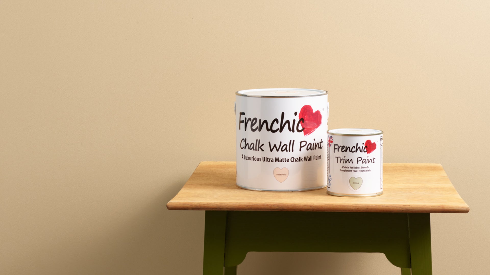
- Matte paint is flat with no shine. It absorbs light and softens colours for a calm, contemporary look. Our Lazy Range, Al Fresco range and Chalk Wall Paint all have a matte finish for this reason.
- Gloss is highly reflective and shiny. Some people see it as old-fashioned or formal, but it’s still a common choice for doors and trims like skirting boards.
- Satin paint is somewhere in the middle with a soft, subtle sheen. Available in our Trim Paint range, it reflects some light to balance warmth and sophistication.
In terms of earthy paints, matte or ultra-matte finishes soften browns and reds. The result is a subtle, calming effect that feels cosy and natural.
Satin or soft-sheen finishes reflect more light, giving earthy shades a modern, polished feel. This is perfect for furniture, kitchens or bathrooms.
Picking the right finish can transform the same shade from warm and traditional to sleek and contemporary, helping your space feel intentional and balanced.
Give earth-tone paint a try
Earthy colours are here to stay. So, there’s no reason not to try earth-tone paint on your walls, furniture or other surfaces throughout the home. At Frenchic, you’ll find all the paint you need to do exactly that in a choice of beautiful, brown-infused colours – from subtle neutrals with brown undertones to striking reddish browns.
Our chalk paints are a fantastic choice for a wide range of projects, whether it’s ultra-matte Chalk Wall Paint, soft satin Trim Paint in matching colours, The Lazy Range for interior furniture, or our Al Fresco range for both indoor and outdoor use.
